HR-tech · B2B SaaS
HRBOX — making a complex HR platform coherent
Different roles, different tasks, one product. My work on role-based navigation, admin workflows and the design system behind them.
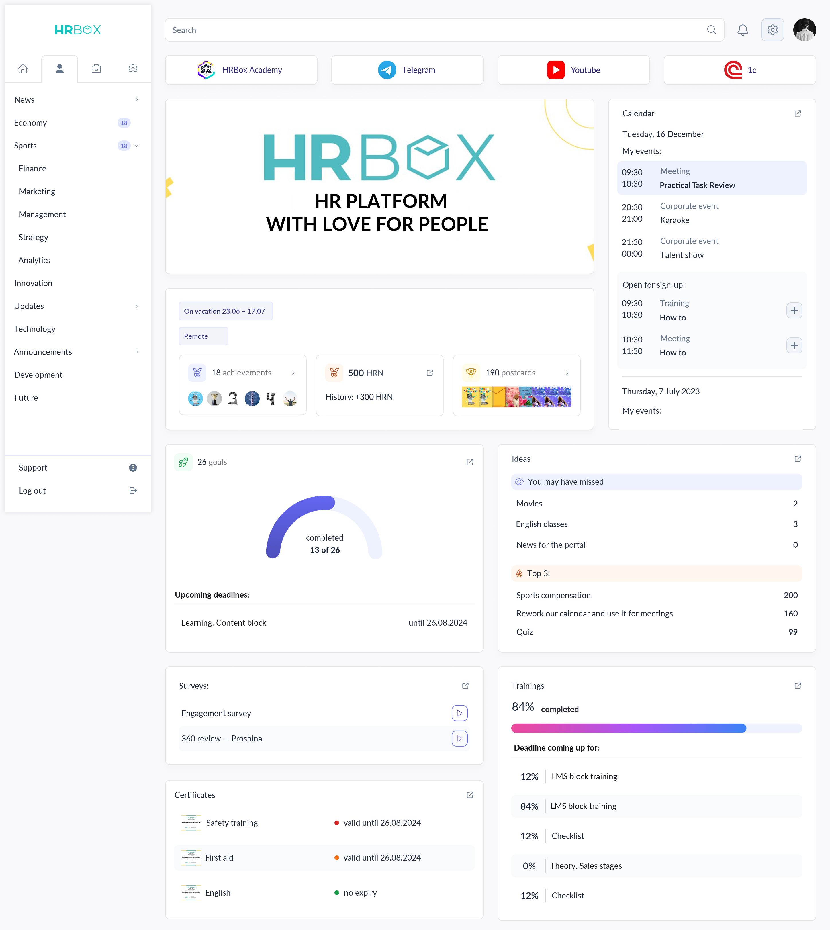
Different roles, different tasks, one product. My work on role-based navigation, admin workflows and the design system behind them.
The product was growing fast — new modules, new roles, new scenarios. But there was no unified system: every section looked different, navigation kept getting more complex, and developers wasted time reinventing components.
A fixed calendar controlled every stage of the KPI cycle. Even after a card had been approved, an employee could not add goals until the next editing date began.
Some clients needed strict dates because the module was delivered against a guarantee letter. Others needed the process to continue as soon as the required action was completed.
Separate the period into two modes: a fixed schedule, and action-driven progression where dates work as deadlines. In the second mode, approval, result submission or another final action opens the next stage.
Status: the two-mode model was accepted and is now in development. The fixed schedule stays the default for clients bound by contractual dates; action-driven progression is enabled per client.
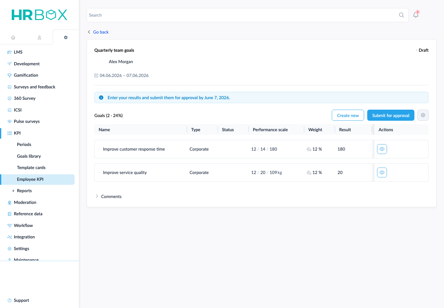
Current KPI card with demo data. The proposal concerns the period logic around this card.
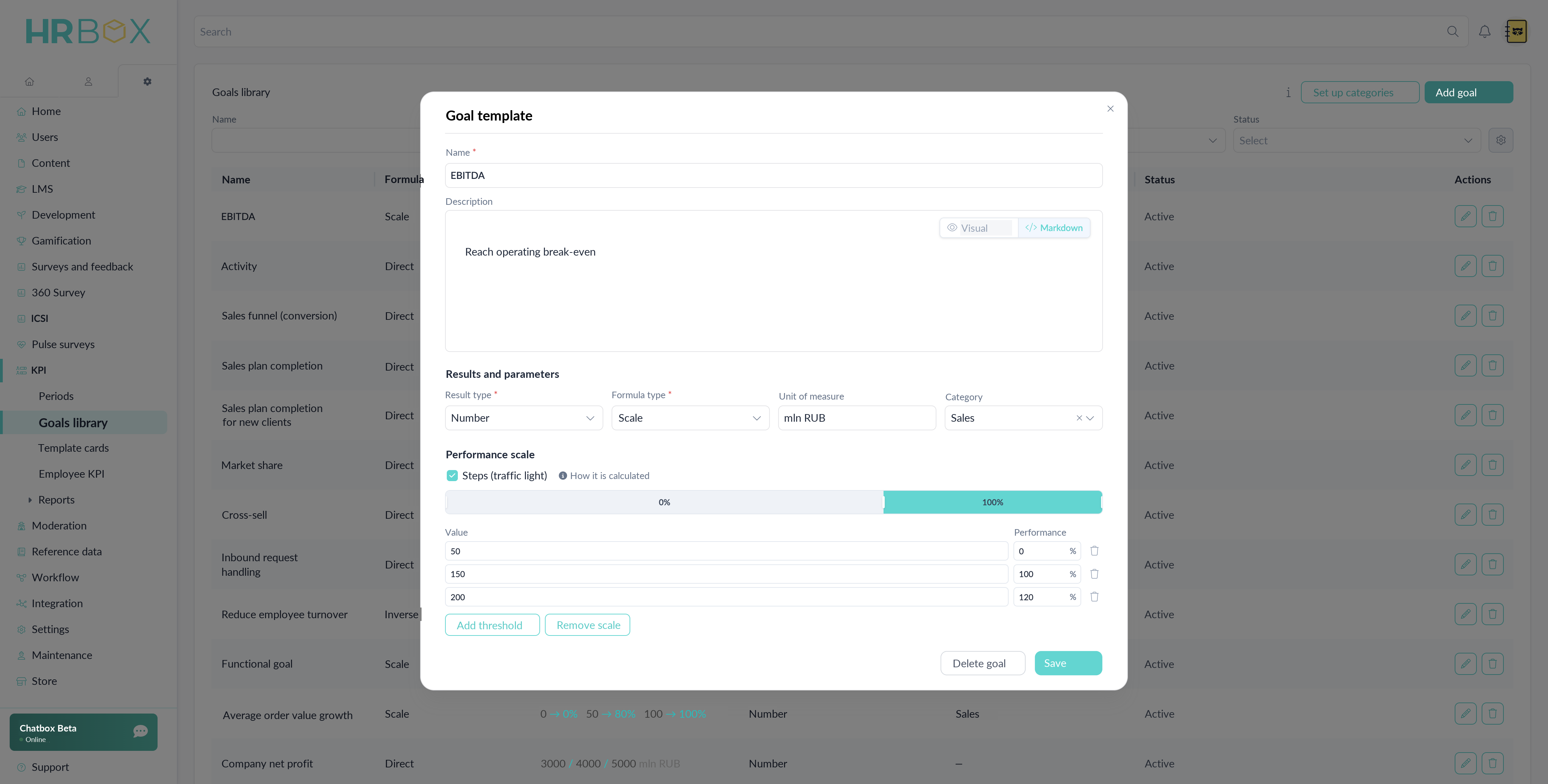
Goal library · A reusable template combines measurement units, formula type and a performance scale.
The platform serves 4 user types with different contexts. Instead of one overloaded menu — separate navigation per role. An employee sees 3 tabs (home, people, portfolio), a manager — 12 sections, an admin — 8 deeply nested modules. Switching between roles happens via the footer sidebar.
The admin panel holds 8 major modules with submodules up to 3 levels deep. To keep new administrators from getting lost, I designed a 12-step onboarding that walks them through key settings. The full architecture map is available via an 'Expand all' toggle.
Employees need everyday tasks close at hand; administrators manage deeply nested settings. The navigation has to support both levels of complexity within the same product.
The interface presents navigation for the current role, while shared components keep the visual language consistent. The diagrams below show the structure; the screens show how it is applied.
The platform went from an MVP without systematic design to a structured ecosystem with a unified design system.
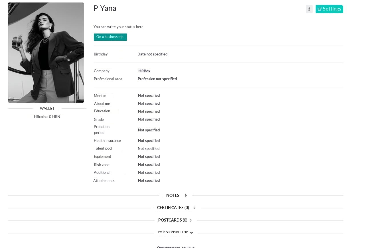
Different fonts, spacing and navigation patterns in every section. Frontend built UI by eye. New modules were added without shared rules.
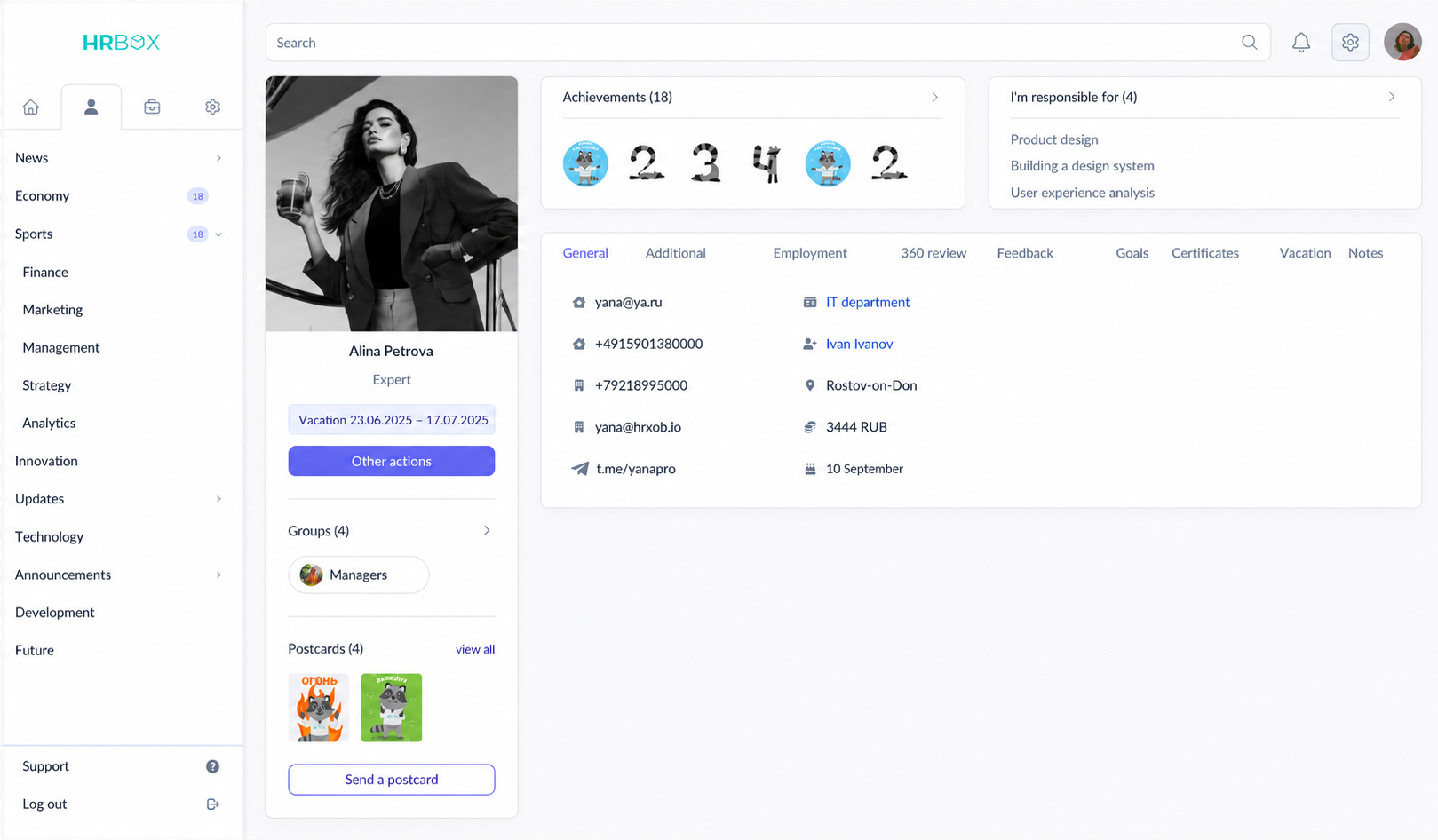
Unified typography, spacing and a component library. Each role has its own navigation but one visual language. Shared components provide a foundation for new modules.
Each role gets its own interface with fitting navigation and tools. Under the hood — a shared design system and unified patterns.
News, requests, training courses, corporate store with HRN currency, achievements, calendar.
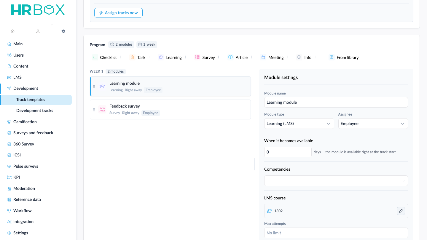
Team structure, employee development and onboarding tracks, employee KPI, goals and OKRs, 360° reviews, feedback and reports.
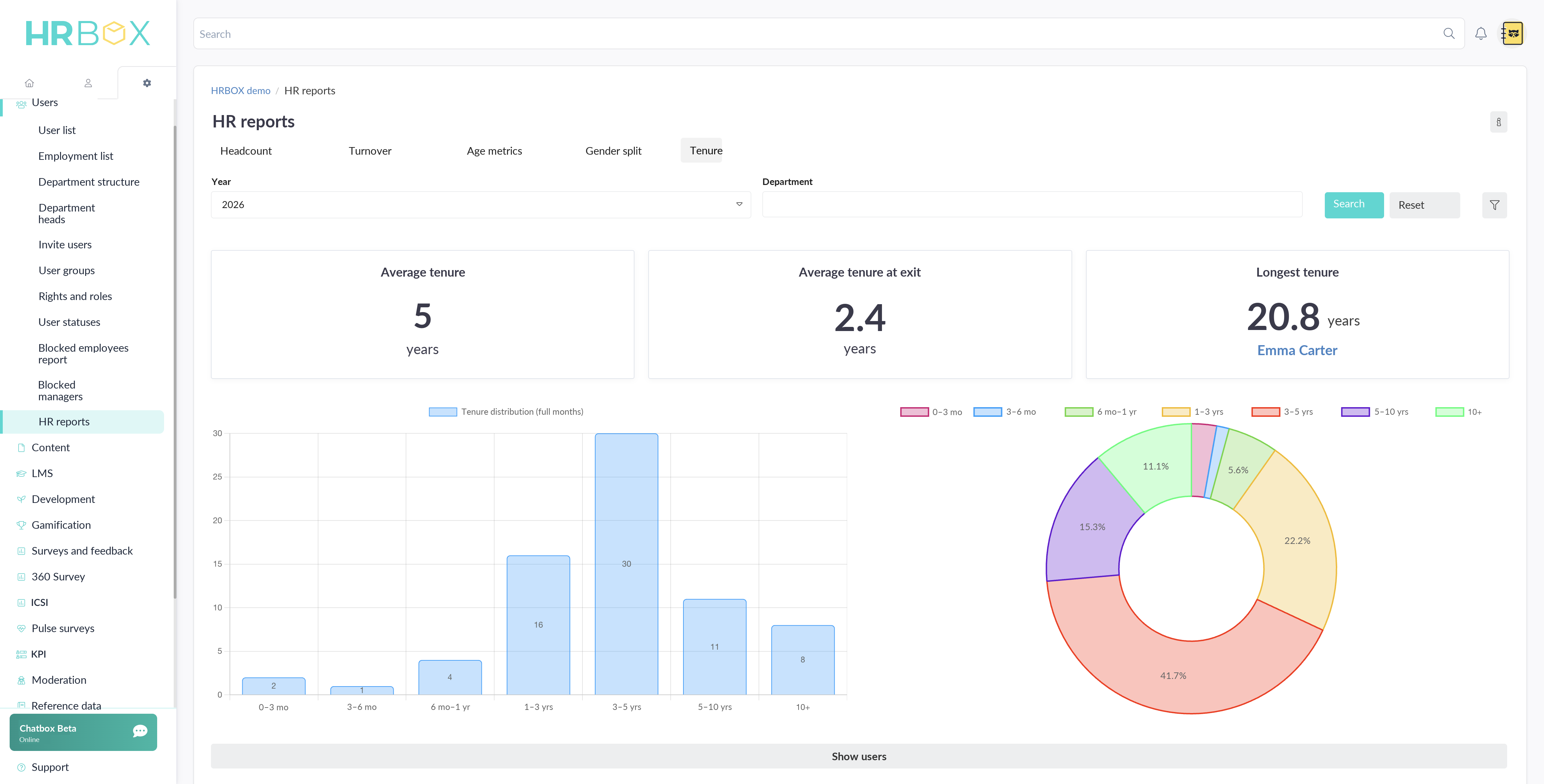
12+ modules: people management, employee KPI, training, surveys, HR e-document workflow, certificates and compliance, integrations and analytics.
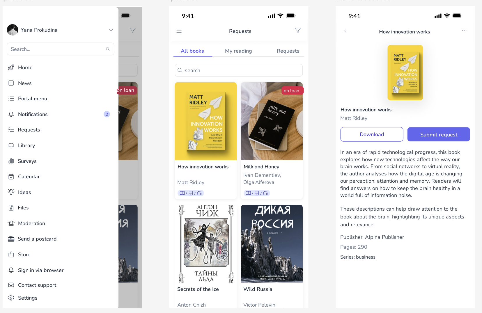
iOS / Android. QR login, news feed, library and book requests, calendar and push notifications.
Interviews and a product audit showed that the roles did not need the same navigation: employees needed quick access to everyday actions, while administrators needed a map of deeply nested settings. This insight shaped the role-based architecture.
Information architecture, navigation models, user flows for key scenarios.
Design system from scratch, component library, screens for 4 role-based interfaces.
Specs for frontend, implementation review, UI bug reports, iterations on feedback.
Discovery did not stop at launch: customer-development interviews with clients on the learning module set the direction for the next iteration of the learning system — and became the starting point for Nanabush, a separate learning platform I now design.
8 major modules with deep nesting. A 12-step onboarding guides new administrators.
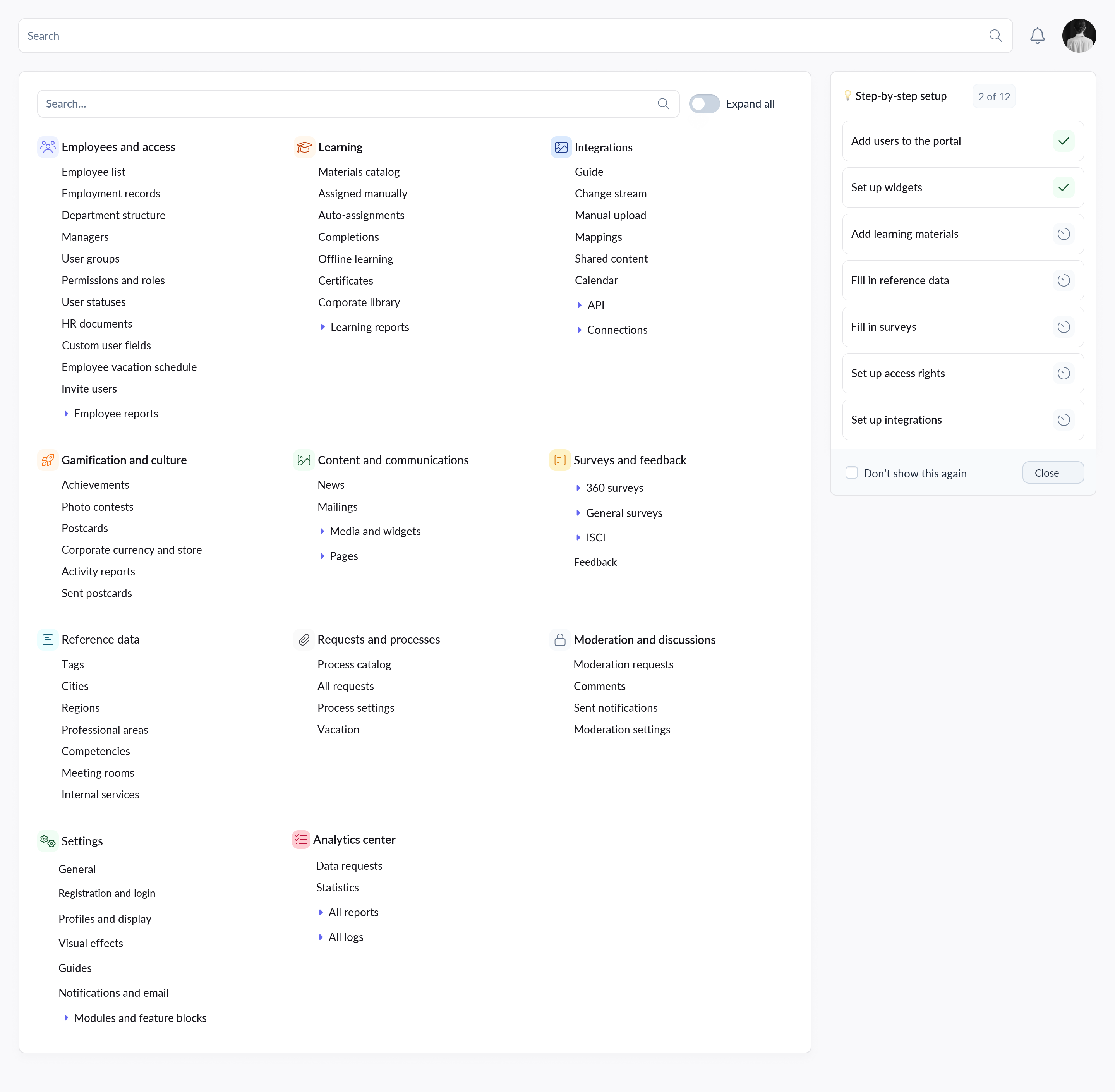 Architecture
A development track is more than a course. It combines employee and mentor tasks, learning, checklists, surveys and meetings into one scenario.
Administrators need to assemble a long program while understanding its sequence, ownership and completion logic. A flat list quickly becomes hard to scan and maintain.
I grouped activities into modules, kept their order visible and brought each step's settings into the same workspace. The administrator can review the full scenario without losing its structure.
Development & onboarding
Shipped interface · I created the prototype from the requirements, incorporated product feedback and finalized the visual implementation in code before frontend review.
Categorized requests, course catalog, corporate store with internal HRN currency, achievement system.
Employee
A data-dense workspace for employee learning: summary metrics, Active / Completed / Inactive tabs, deadline statuses and circular progress indicators.
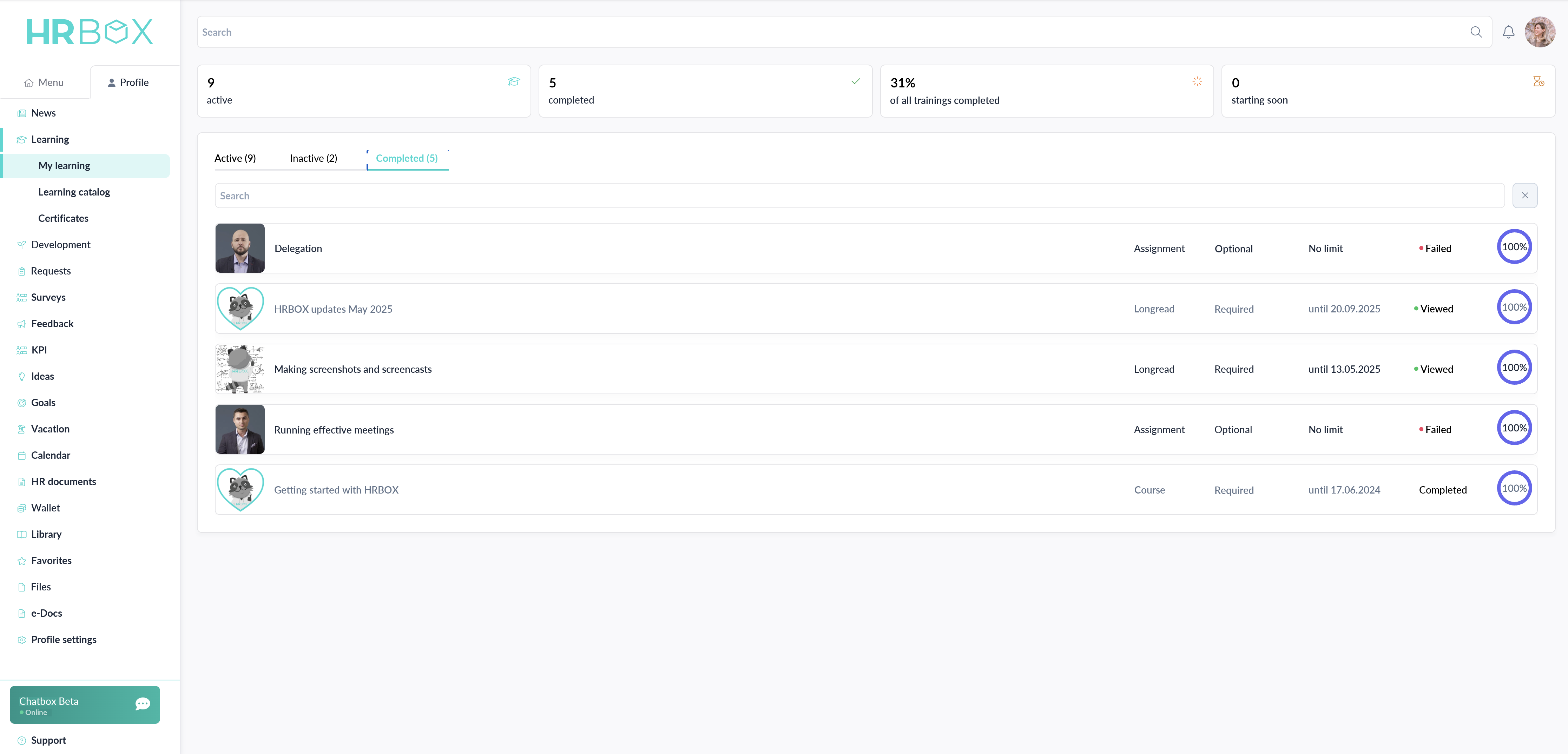
iOS and Android. Login via domain or QR code. News feed, library catalog and book requests, calendar, reactions and comments.
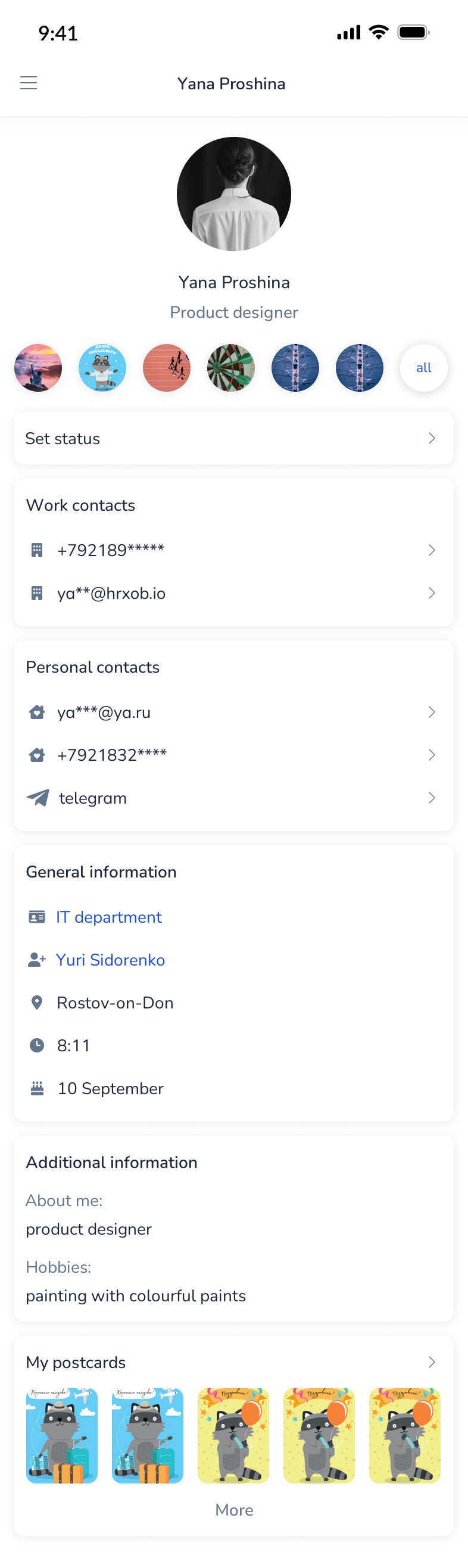
Contacts and personal data

Feed, widgets, activity
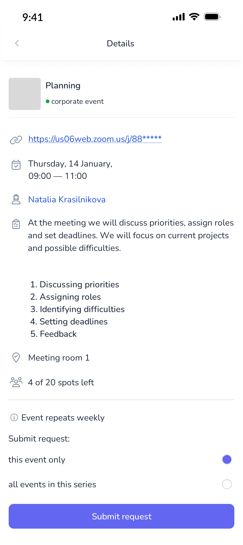
Event details and sign-up
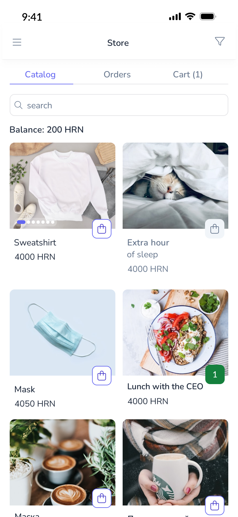
Catalog and ordering
Built from scratch. Tokens, components with all states, documentation for frontend and QA — plus a Storybook for the Vue component library that I set up and maintain myself, so design and code share one source of truth.
Indigo primary · Slate neutrals · Client-configurable colors